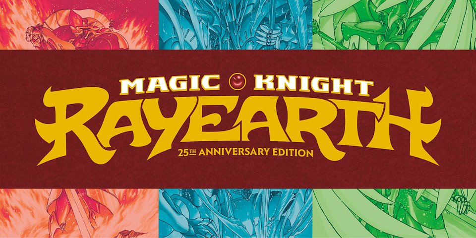
Magic Knight Rayearth 25th Anniversary Edition Box Set
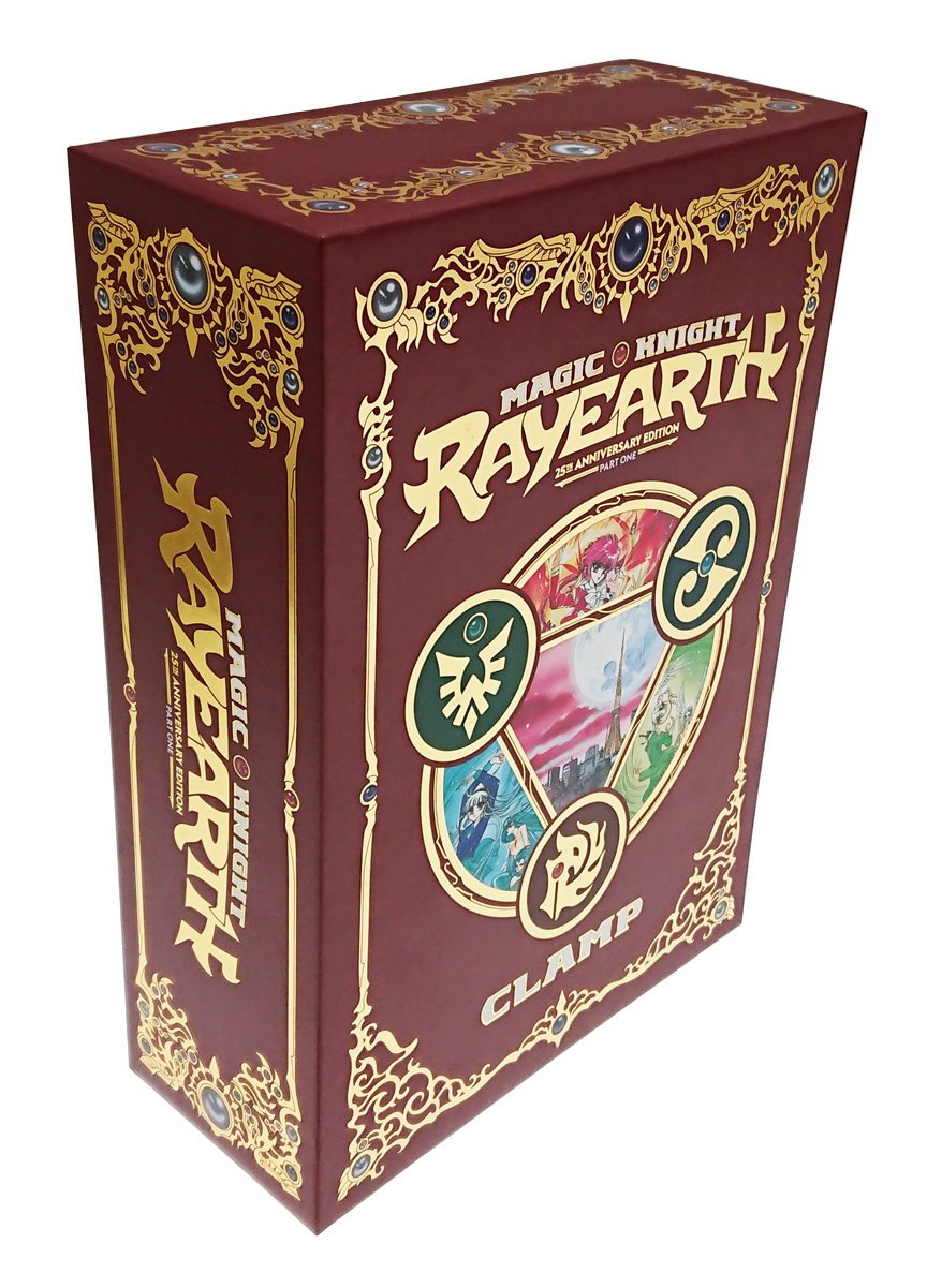
Photo of the finished box for part 1, front view
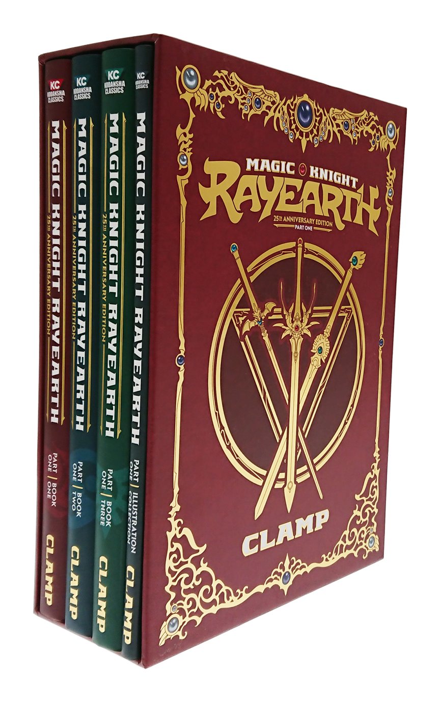
Photo of the finished box for part 1, back view
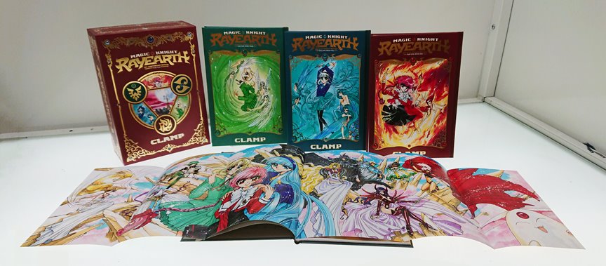
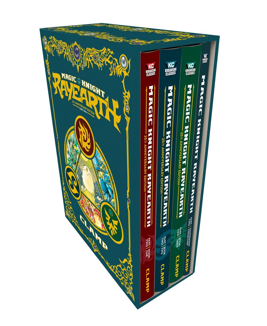
Photo of the entire first set, including all four books (the fourth book is open to the fold-out at bottom)
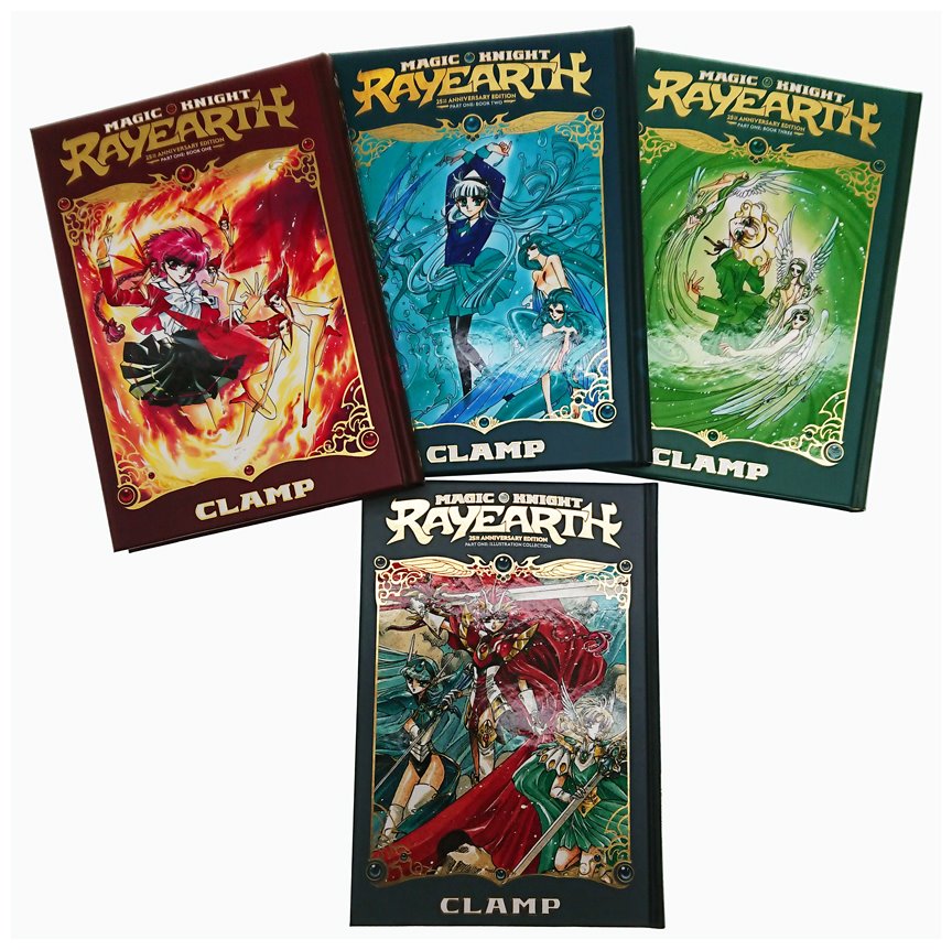
Photo of the front covers of all four books in part 1
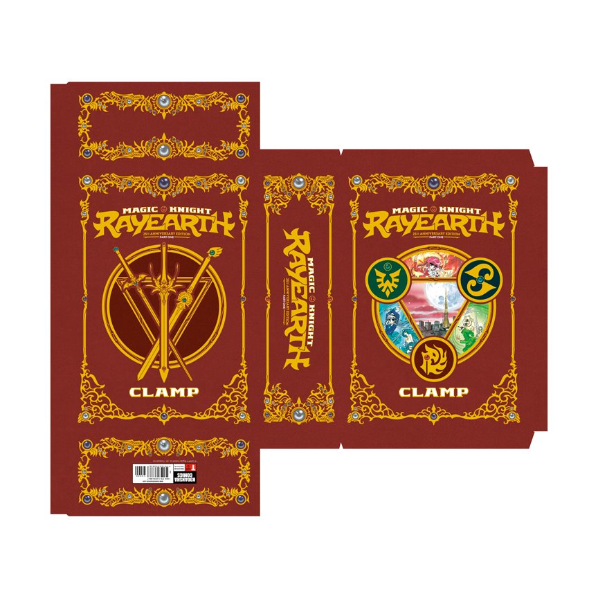
Print file for the part 1 box
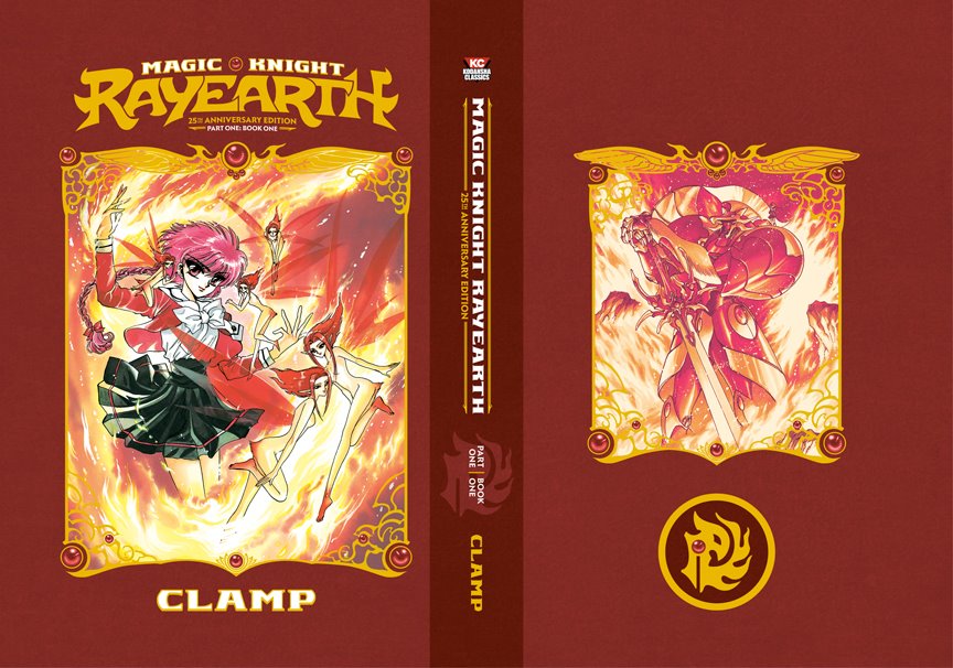
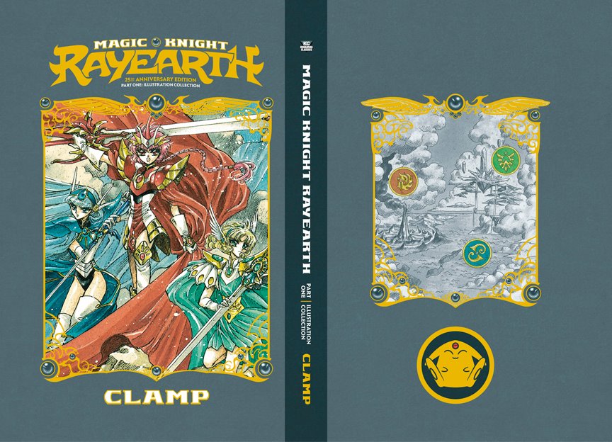
Full cover for part 1 / book 1
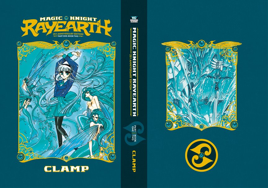
Full cover for part 1 / book 2
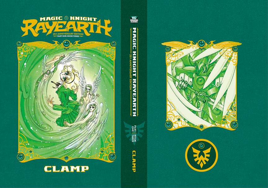
Full cover for part 1 / book 3
Full cover for part 1 / Illustration Collection
Mock up of part 2 box set, spine view
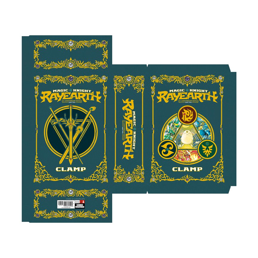
Print file for the part 2 box. There were numerous discussions about what color the second box would be, and I tried every variation that everyone came up with. Making it blue had always been my initial plan, and eventually everyone agreed it was the best choice.
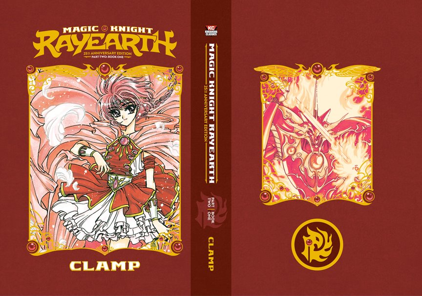
Full cover for part 2 / book 1
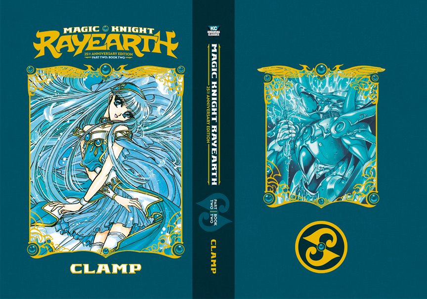
Full cover for part 2 / book 2
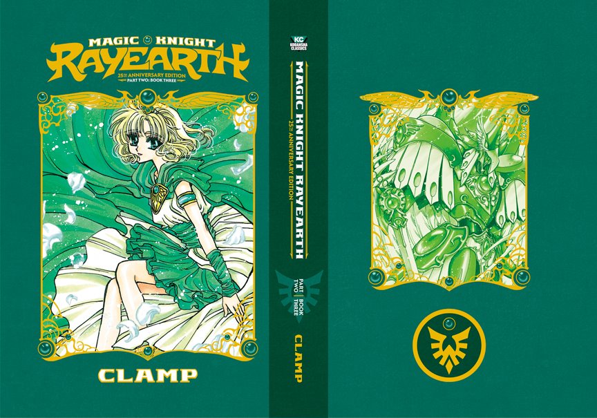
Full cover for part 2 / book 3
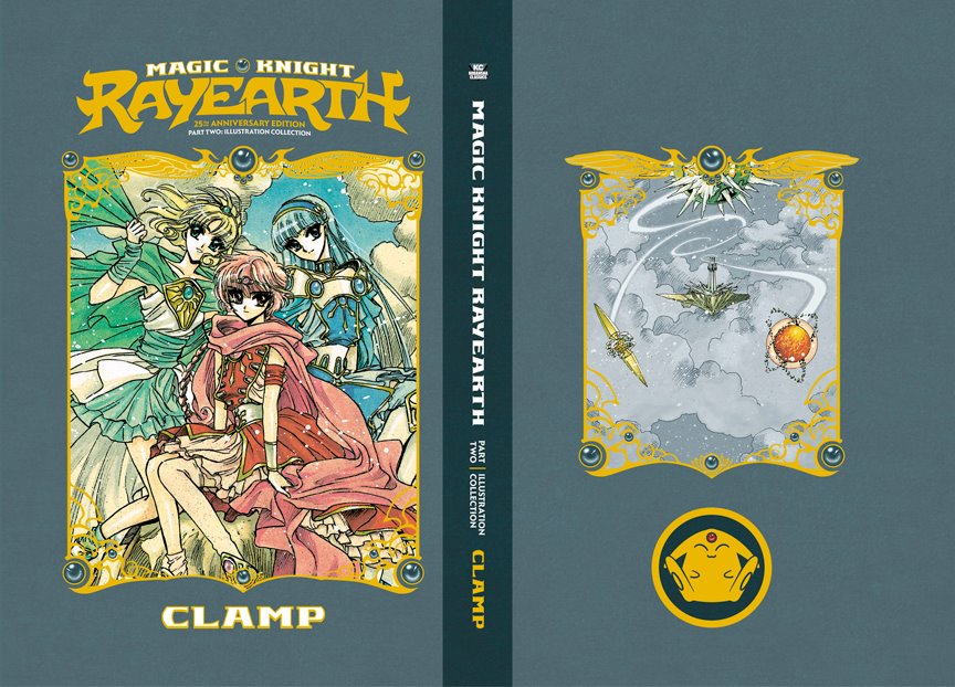
Full cover for part 2 / Illustration Collection
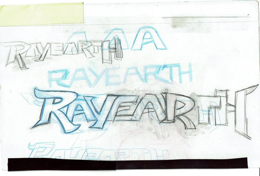
As near as I can tell, this is the very first sketch i made for the Rayearth logo--or at least the first sketch for the version that was eventually made. I had a pretty clear idea from the start what I wanted it to look like, especially the overall shape and feel of it. Considering that I was designing this while designing the covers and box set at the same time, I had to take into consideration how they would all work together in a cohesive fashion.
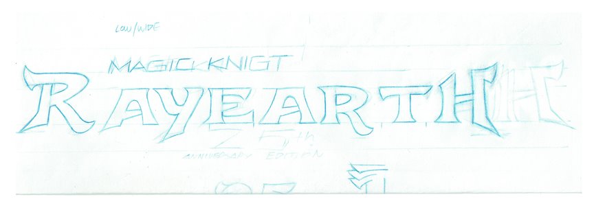
After many, many drafts on tons of tracing paper, trying to work out the respective nuances and character of each letter form, I eventually got to this sketch, which is a very rough, spaced-out layout. Basically my hope was to get the individual forms nailed down and make them more solid sketches, so I could then arrange them digitally to match the general idea of my original sketches of the entire logo. This is basically my layout of the letters to be traced digitally--still just cleaning them up in Photoshop, I'm not moving to vector yet.
This is the end result of that initial trace and clean-up; a straight and simple version that I can show for approval. I'm hesitant to do too much more without the okay from the home office; at this point I'm about 30 hours deep on the logo alone, so I didn't want to invest more time in something that wasn't going to get approved--so the best thing to do would be to show my week and get feedback, see if this was going to work for everyone.
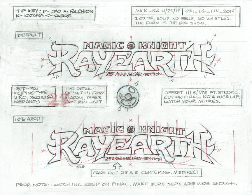
As that cleaned up sketch was being sent for approval, I cleaned up my sketches into this presentation piece of the logo--it compiles several different sketches and notes I'd written in margins along the way, so it's part plan but part record as well. It helped me smooth out some final bumps, and I also think it just looks really cool. I'd like to do more breakdowns like this in the future.
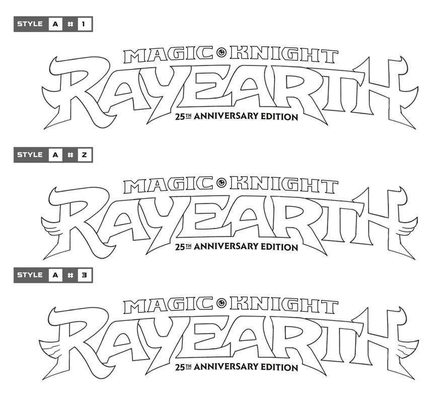
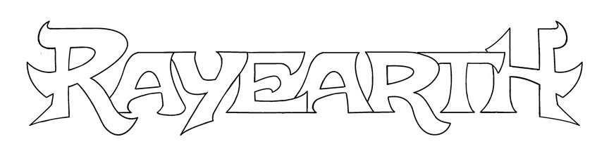
While everyone was happy with the logo concept, I was asked to do 2 or 3 additional designs just to give options. I wasn't exactly excited about giving options that I didn't want picked, but I did come up with additional designs. They were decent, but I didn't feel they were anywhere near as strong as the original concept. Thankfully, after sending the vector proof of the original concept (shown here) along side proofs of the new concepts, it was decided that this was the strongest one and to take it to completion. I debated showing the other ideas here, but decided not to so as to avoid confusion, as well as hold on to them in case they work better for something similar in the future.
This is the final, black and white version of the logo. The only difference between this and the final usage is the jewel in the middle between "magic" and "knight". I originally used a vector version of the jewel, this would later be changed to one of the raster image jewels I made custom for the box sets and covers.
The final logo in a three color version, to be used for promotional purposes and situations where the background might make a single color version illegible.
The final logo as it appears on the box and covers, except for the jewel in the middle.
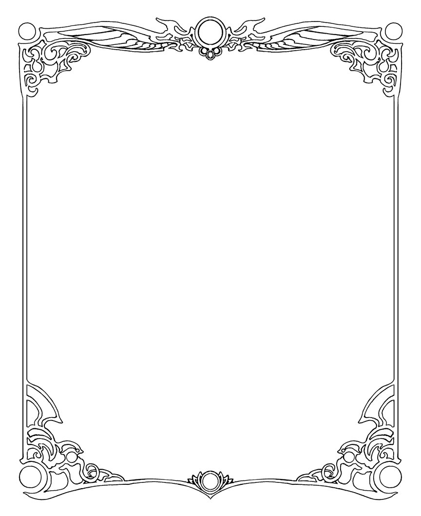
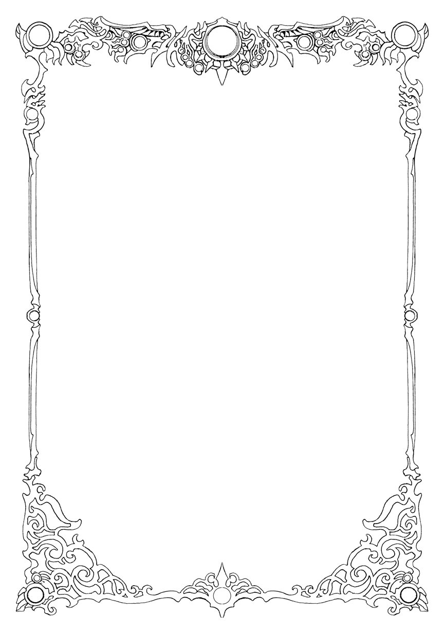
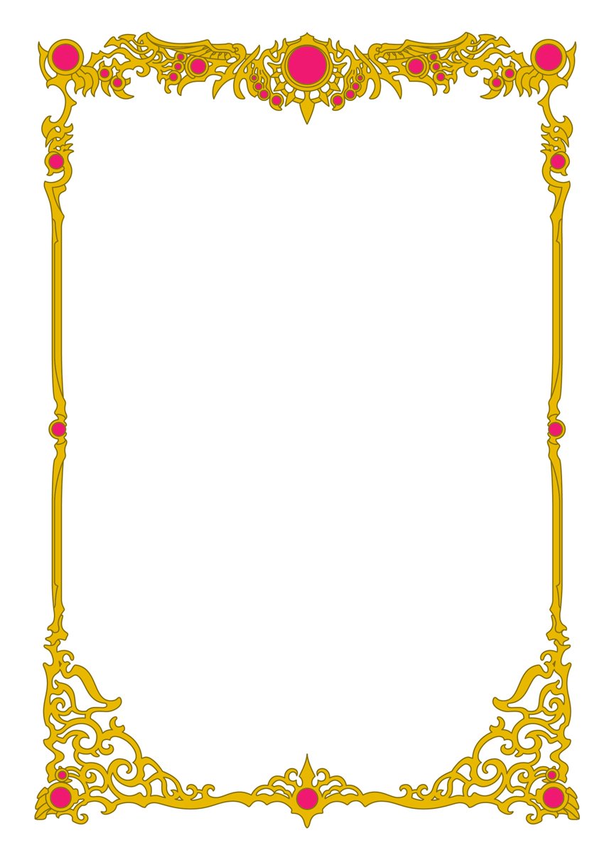
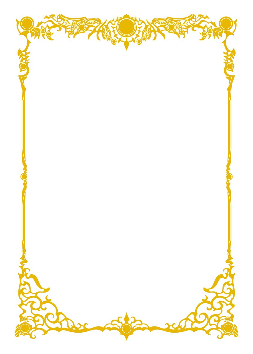
This is the original frame I pulled together from several interior images. It's a very rough, black and white approximation of a frame used by CLAMP several times within the set, especially in the illustration collection. As the original versions are all hand drawn and all have slight variations, I had to cobble them together into something uniform that I could manually trace in Illustrator. I knew we were going to be foil stamping this frame, and a hand drawn frame was not going to be exact enough for that purpose.
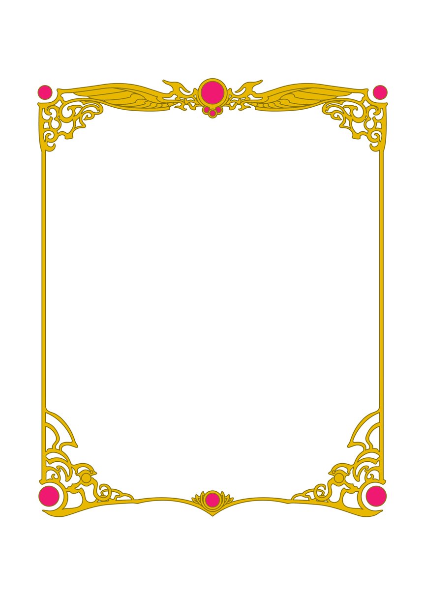
This is the vector version of the book frame, with separate solid parts so it could be manipulated and rearranged if need be. The tracing and combining of parts took several days because it was so intricate.
Here is the final single color version of the book frame. The original treatment called for all the frames to be aligned in the middle of a space cut out of the image--so the red background would act as a kind of outline around the frame itself, making it very prominent and giving it extra depth. Very late in the printing process we were told by the printer that they could not align such a complex object within the space consistently across multiple printings, and so at the 11th hour I had to go back in and change the layout of the entire set to have the frames sit right on top of the artwork directly. The end result is good; i don't know if it's better than what the original plan was--but since it was apparently impossible to print, it didn't much matter.
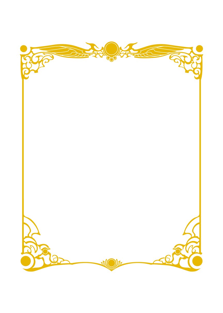
Original art pulled together to form the frame for the box. This design was also eventually pulled apart and rearranged for the sides and top of the box as well.
This is the vector version of the box frame, with separate solid parts so it could be manipulated and rearranged to build the frames for the top and sides of the box as well. There had been talking of making completely different frames for the top and sides, but when I mocked it up it looked far too disjointed. It would also add a few more days to the process, so in the end, the better option was also slightly easier, which is a rare thing.
The final single color version of the box frame. Building a vector object like this is one thing; building it to be adjustable in one direction because the final specs of the area won't be finalized until later in the process is something else altogether.
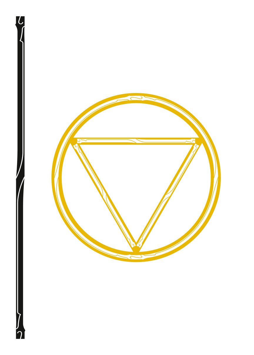
Shown here is the circle / triangle graphic used on the front of the box, alongside the custom stroke I used to make the shape.
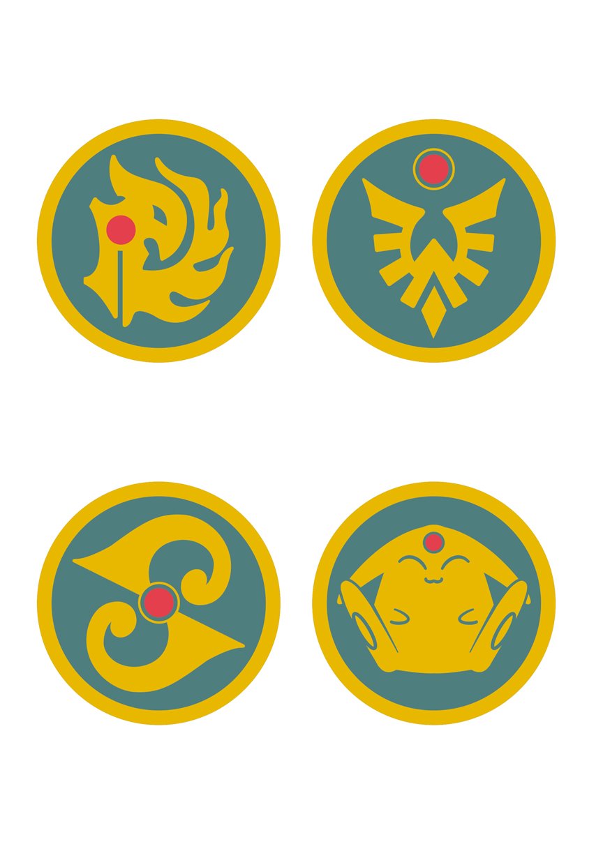
Here are the final vector versions of the four symbols that are on the back covers. These had to be traced over several different versions of the icons found within the interiors; there weren't a lot of perfectly straight on shots to work from, so these ended up being more difficult than I originally imagined.
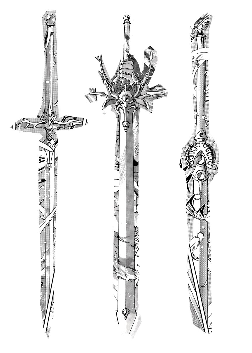
Once it was decided that the back image of the box would consist of the three weapons, the search began for straight on shots of the swords to be used as a model for the vector versions. Shown here is a rough mock-up of the only full shots of the swords I could find.
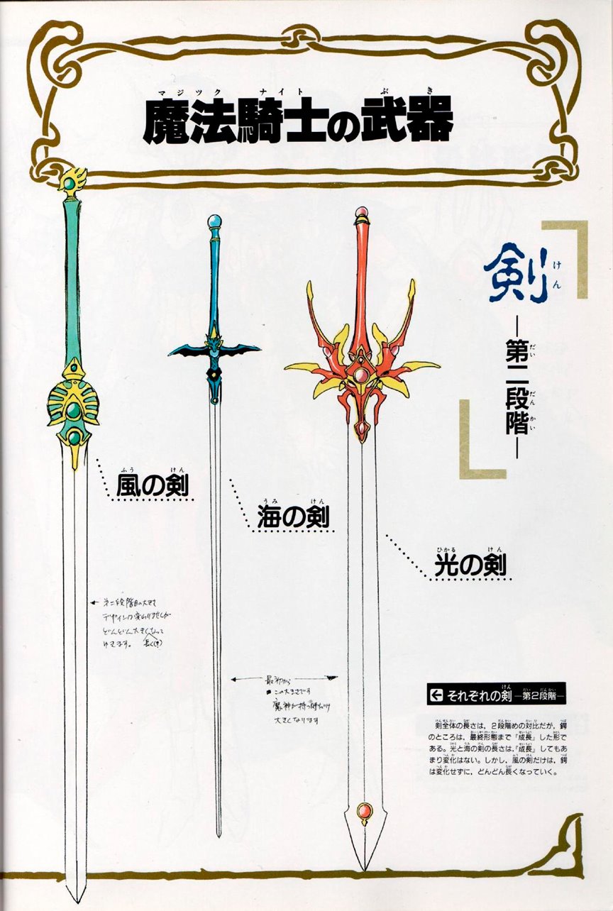
This image was from (I think) the illustration collection, and it proved to be invaluable because it showed a proper scale and comparison between the swords and their size. I originally had drawn them all too similar in size, and this image helped me considerably in fixing that.
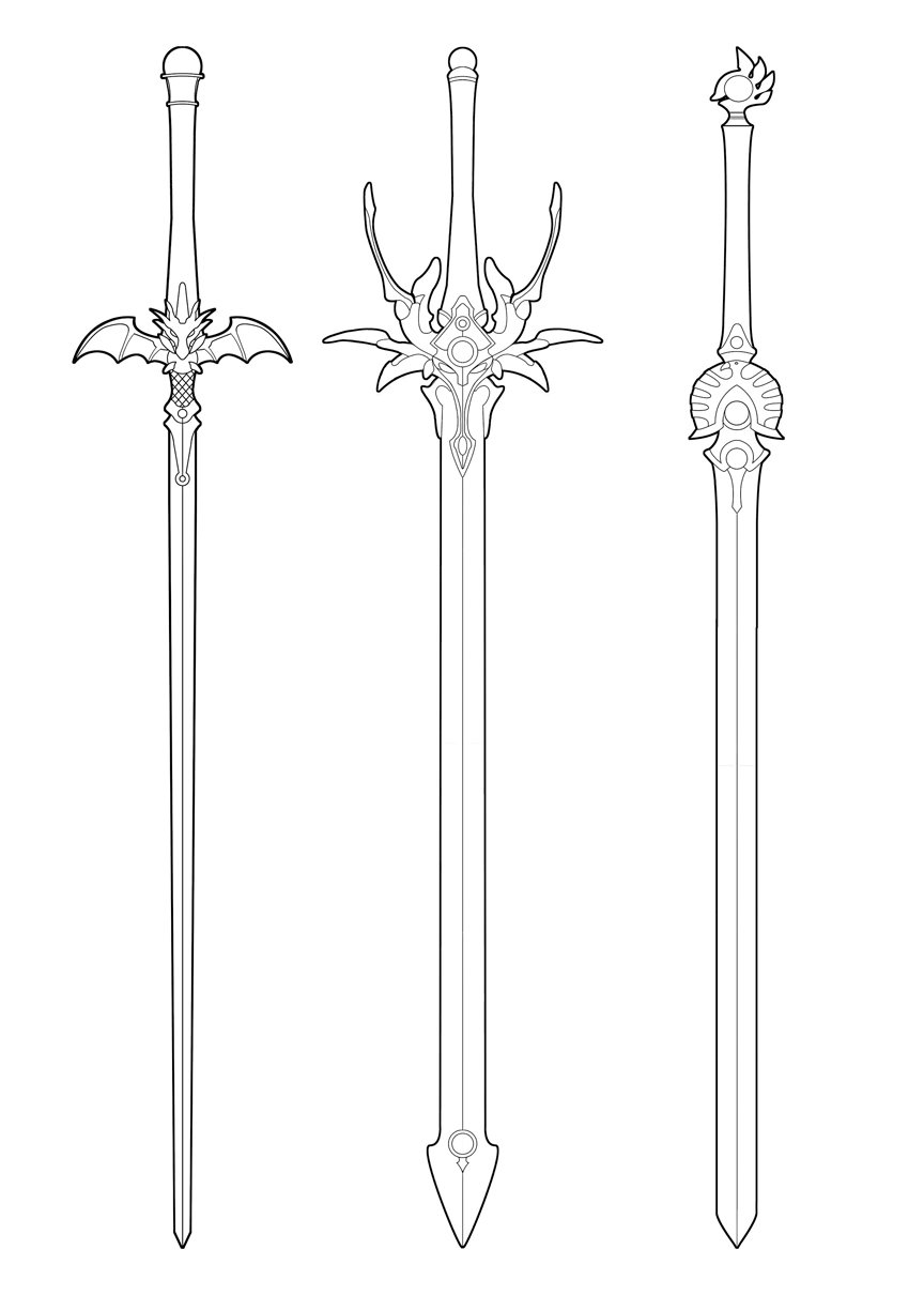
Here is the very cleaned up black and white sketch of the swords. I know the parts that were symmetrical were drawn once and flipped, but I can't remember if that was done in the Photoshop version or on the next step when it was manually traced in Illustrator. My guess would be in Illustrator, since that would be easier.
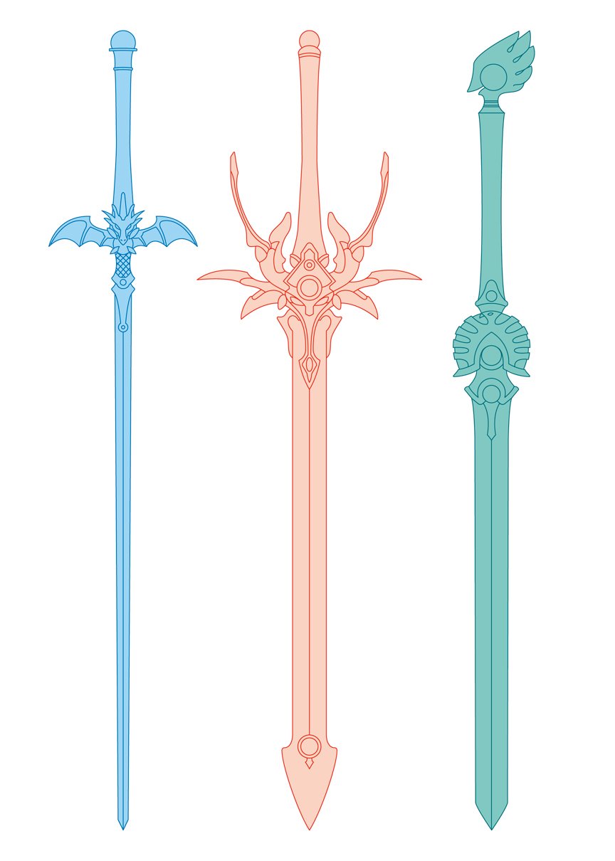
This is the final vector version of the swords used on the back of the box. I had to build this in parts because I knew the swords were going to cross and overlap, so I needed to be able to break them apart without destroying them outright.
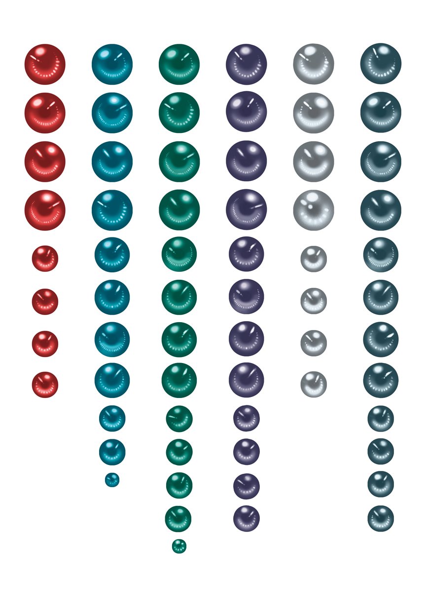
This is an image showing all 64 of the custom eyeball jewels that I made for the set. I originally tried to use the jewels directly from the original art--but since the art was all done analog, and over 25 years ago, it was very hard to regulate the size and color between them, and if I'd used the original art for these, there would've been a lot less variation of the actual jewels across the set. So over the course of a weekend, I approximated a design that was similar to the originals, and set out to make as many different variations as I could. Almost every single jewel in the set is different and unique--there are repeats, but not many. It's a little thing, and almost no one would notice, but I wanted the reader to know that the person making this really cared about doing it right and giving them something special. It's hard to illustrate the amount of care that goes into something like this; the average person would have no idea what something like this entails, nor should they, really. But love is something you can't fake if it's not there, and it's something you can't hide if it is.
Description
Design and print production work from the expansive Magic Knight Rayearth 25th Anniversary Edition Box Set Part 1 and Part 2 from Kodansha Comics.